You are using an out of date browser. It may not display this or other websites correctly.
You should upgrade or use an alternative browser.
You should upgrade or use an alternative browser.
Miscellaneous News Thread
- Thread starter semipenguin
- Start date


Channel98
Don't yell or hit.
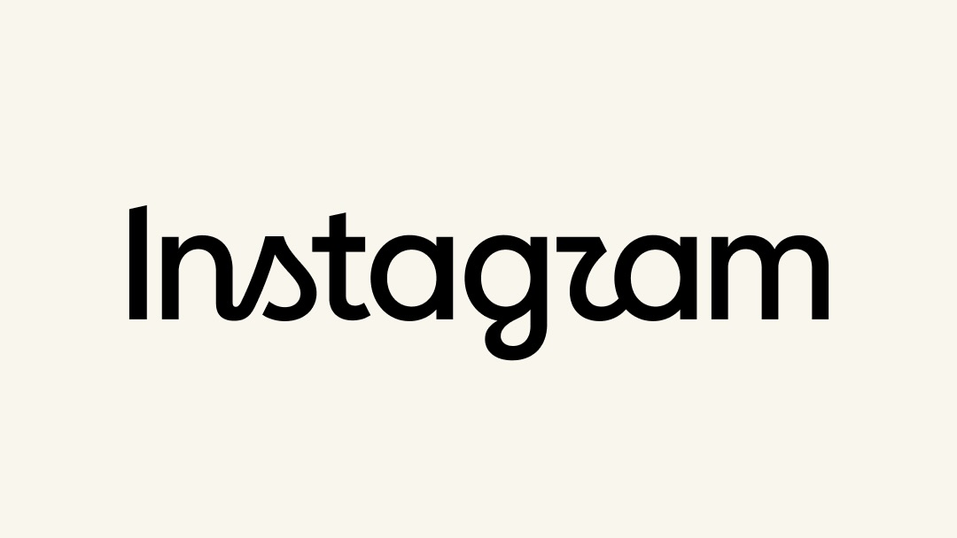
"All right, class, let's all spell the new logo together: I-N-S-T-A-G-uhhhh, hmmmm, well, what exactly is that?"
 arstechnica.com
The new Instagram logo is the perfect embodiment of AI slop
Opinion: Some remarks about the new wordmark accidentally being perfectly awful.
arstechnica.com

scotchandcigar
All I wanted was some steak
It looks fine to me."All right, class, let's all spell the new logo together: I-N-S-T-A-G-uhhhh, hmmmm, well, what exactly is that?"
The new Instagram logo is the perfect embodiment of AI slop
Opinion: Some remarks about the new wordmark accidentally being perfectly awful.
Channel98
Don't yell or hit.
So to you the crooked, upside down "2" looks like a small "r"? Here, this might amuse you:
 digitalsynopsis.com
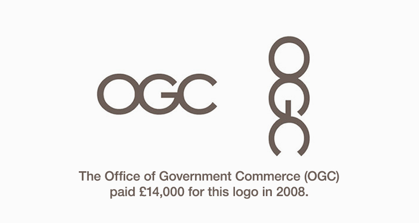
Top 25 Most Epic Logo Fails Of All Time
These impeccable works of art are the direct result of what happens when: (1) Clients take design matters into their own hands (2) You want a quick logo
digitalsynopsis.com
scotchandcigar
All I wanted was some steak
It looks like a cursive "r", because it is a cursive "r", with the side of the "g" acting as the start of the letter. There's nothing surprising about the "r", since it follows a cursive "n", "s", and "g".So to you the crooked, upside down "2" looks like a small "r"? Here, this might amuse you:
If anything, those wet-behind-the-ears kids will be confused by the cursive "s" before they get to the "r". But screw them; let them learn something.
scotchandcigar
All I wanted was some steak
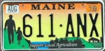
Some good ones. Not sure if they are all real, though. But this is. It's the Maine Agriculture plate; one of several designs you can choose for a passenger car. Mrs. Scotch and I call it the pedophile plate.Here, this might amuse you:
Top 25 Most Epic Logo Fails Of All Time
These impeccable works of art are the direct result of what happens when: (1) Clients take design matters into their own hands (2) You want a quick logo